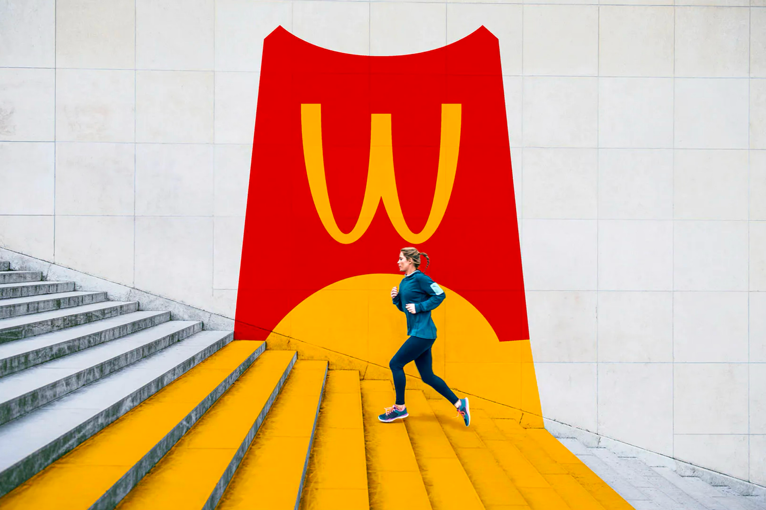
McDonald’s
Transforming McDonald’s ordering & fulfillment process
Redesigning an ordering experience that serves millions of daily users across the world, while accommodating complex fulfillment options and creating a foundation for future capabilities like delivery integrations and a refreshed loyalty program.
My Role
My role evolved over the years from a Product Designer to Design Lead, where I owned multiple product feature sprints, rapid prototyping cycles, and user testing sessions across this type of work.
96%
Earned 4.8/5 star rating from 3.7 million app store reviews.
#1
Surpassed Starbucks for the #1 most downloaded food and beverage app.
127M
App downloads in 2022.
-30s
Reduced average service time by 30 seconds.
As McDonald’s continued to invest in new technology, wanting to introduce new ordering methods in the wake of rising competition and a global pandemic, myself and my team got to be at the forefront of that introduction.
We brought countless new features and innovations to millions of app users on a daily basis, stressing the details after checkout to ensure smooth order completion.
Ushering in a New Era of Fulfillment
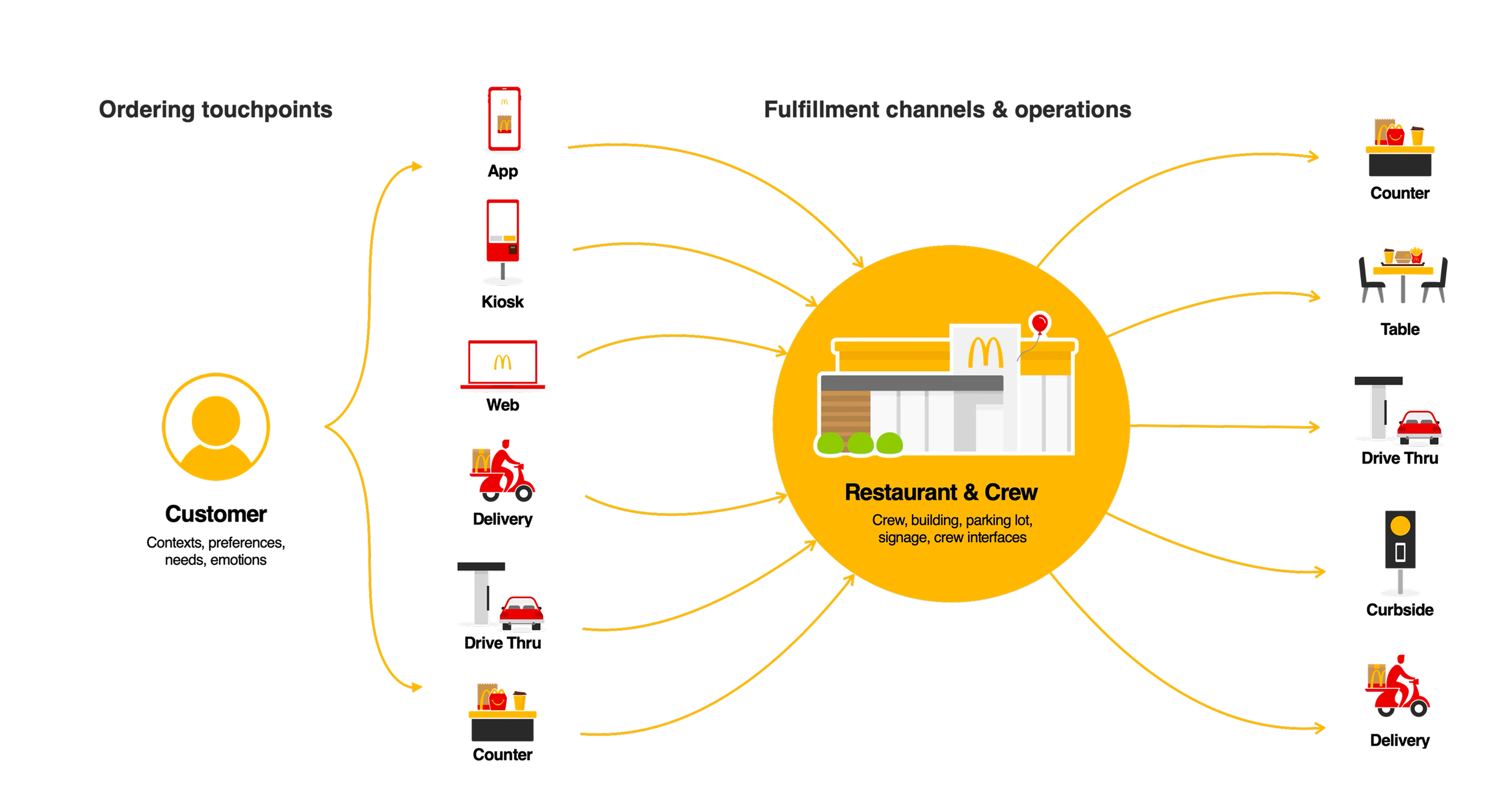
Regardless of what type of fulfillment we focused on, our job was always complex when we factored in the multitude of options that were available for the consumer. With every feature we introduced, countless tests were ran to ensure not only were the features successful, but were they going to work in the various markets that they needed to support.
Ordering Your Way
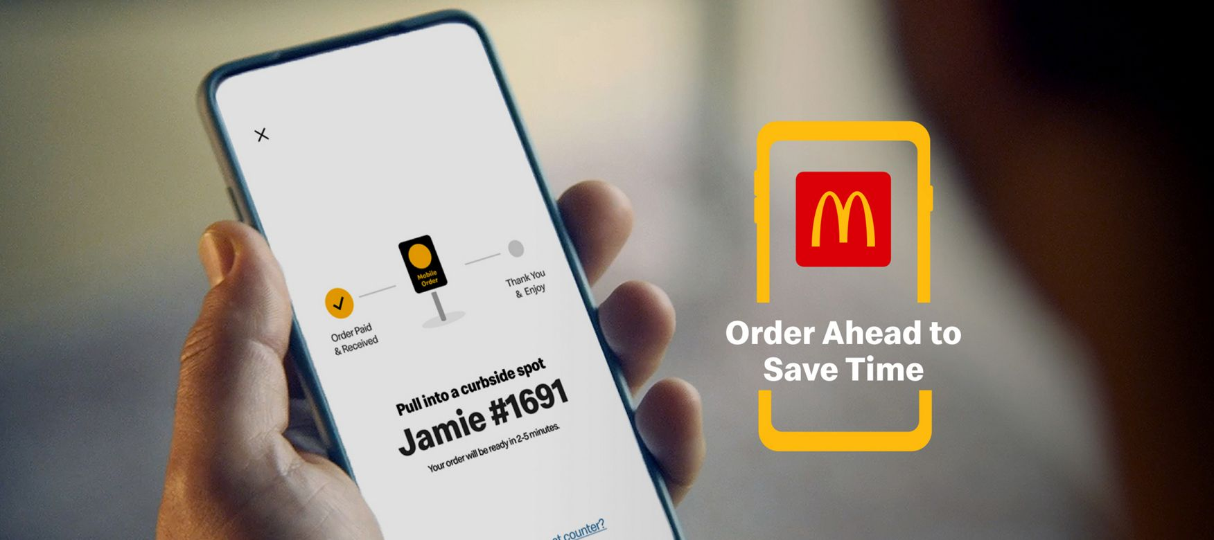
From the various methods of drive-thru, drive thru pick-up, counter pickup, curbside ordering, or direct table service, once the user had completed their bag, we worked tirelessly to ensure any gate they’d meet in terms of completing their order was extremely clear and easy to navigate.
The options for fulfillment would change depending on market and what was available at the chosen location, as well as what the user had in their bag at the time. These screens in particular were iterated on hundreds of times to ensure all edge-cases were accounted for.
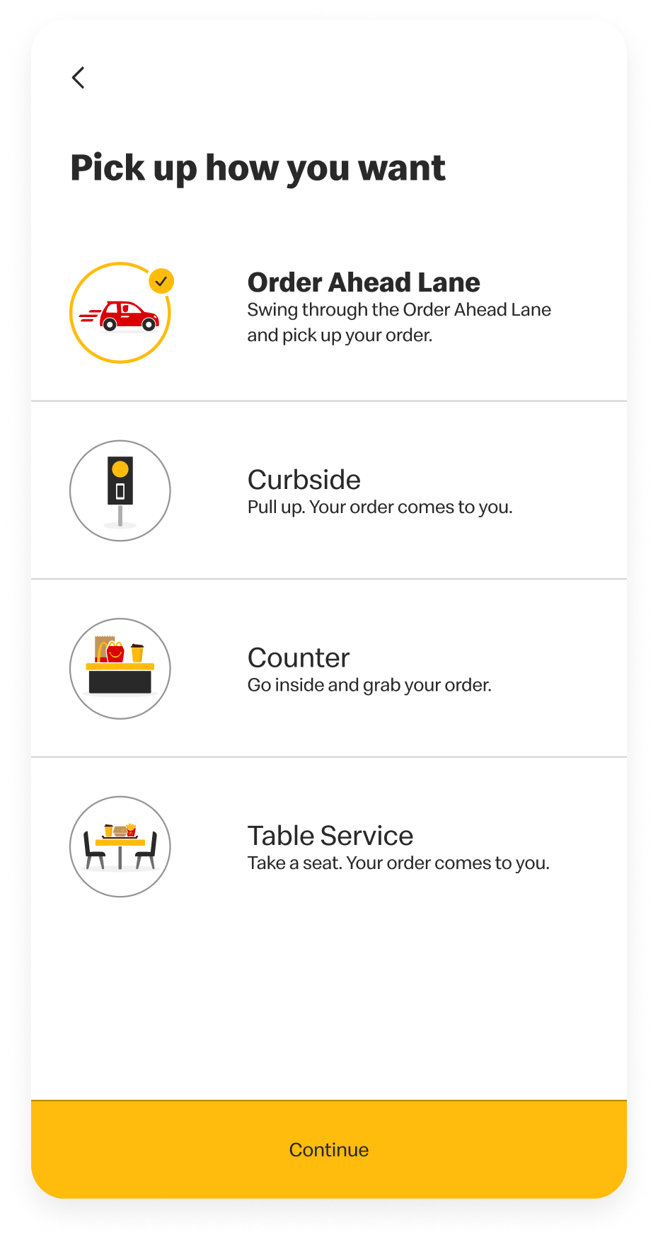
I designed all the interactions and animations for our users choosing their pick-up fulfillment method, as well as brought McDonald’s signature ‘feel good moments’ to the order confirmation screen. All animations I created were done using After Effects and exported as Lottie files, a first for McDonald’s.
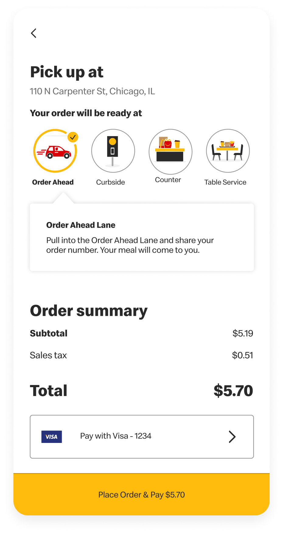
Redefining the Order Tracker
Depending on what fulfillment method the user chose, we needed the order tracker to be accessible and as clear as possible to the user as they also navigated actually arriving to the location.
In testing we found we needed multiple areas of educational support around functionality, ensuring the customer that help was immediately available.
When we introduced new fulfillment methods like McDonald’s Order Ahead Lane, a conveyor system that would deliver the user’s food in a special pick-up lane, I illustrated and animated the process for first time users to ensure further moments of clarity.

Edge Cases on Edge Cases
As with everything in this process, we tested and accounted for the various edge cases that applied to order pick-up.
With the Order Ahead Lane specifically, we ran usability studies at an on-site location where they were piloting the lane technology. This allowed us to test multiple user identification methods; should users have location services enabled or disabled, bluetooth enabled or disabled, and whether the location supported geotracking.
Outcomes & Takeaways
Be Descriptive
Language and visuals needed to be direct and exact. We workshopped a lot of variations to ensure that we weren’t being cute for the sake of the brand and at cost of comprehension.
Plan for the Worst
This team was fantastic at understanding that baseline designs were not good enough. We uncovered every permutation and flow in these projects to ensure we were covering our bases.
Complex ≠ Undelightful
Even projects that have larger scopes, higher impact, and more complexity can still benefit from engaging and delightful moments throughout the experience.