McDonald’s
Building McDonald’s Design System for the global market
Despite being one of the world's most recognized brands, McDonald's lacked a cohesive digital design language that could scale across its massive global footprint. I led the team that implemented new foundations for all current and new components to be built upon; from style guidelines, illustration and icon libraries, to pre-built templates be used by the design team.
My Role
I audited the app, web, and kiosk experiences and documented every unique and duplicative component being used across all three products. I rebuilt all components abiding by new rules and regulations written and set in collaboration with our internal design teams, client stakeholders, and developers, and introduced new motion guidelines for Lottie animations across the app.
60+
Markets gained access to a cohesive product experience.
85+
Unique mobile app components.
135+
Unique Kiosk components.
78%
Improved productivity for UX and design teams.
Audit & Process
Upon my arrival to the account, work was just getting started, and in that process, chaos was the name of the game.
I orchestrated the prioritization of auditing our work to start the wheels turning on creating a true set of libraries we could rely on.
These are audit files that I created by combing through countless design files and capturing any and all duplicative or visually similar design elements. The idea was to know where we had overlap so that we could unify and reapply.


While at this point the products were starting to see the new design ethos brought by the team, we still had a lot of screens that were using old and outdated designs and components. This effort not only was to increase our team’s design efficiency, but also identify the areas that needed to be fully updated and redesigned.
Global Styles
I focused on setting new standards for global styles first. This way, any work we did as we narrowed components and rebuilt them, would be following a new set of guidelines the full team had agreed upon.
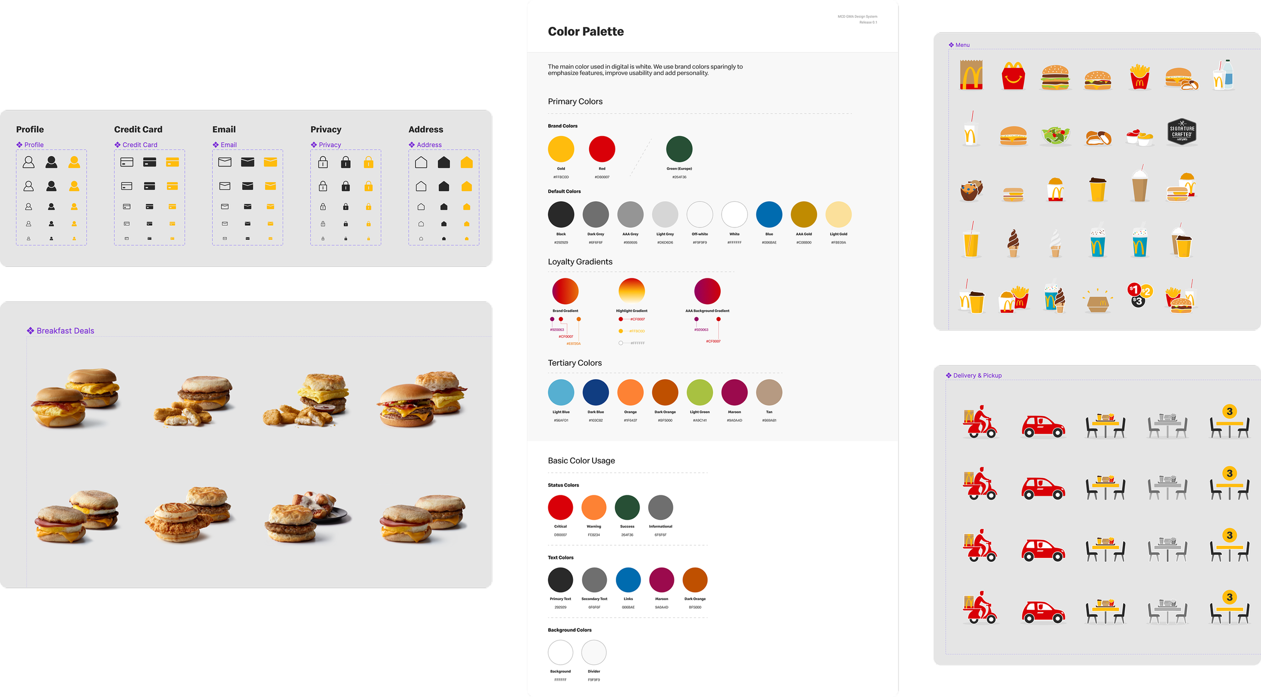
Everything from color palette to product photography was assessed and adjusted to work within the new system. For the first time, my team was able to access all of McDonald’s product photography library through design components. Further, we rebuilt and redesigned icons and brand illustrations for their own libraries.
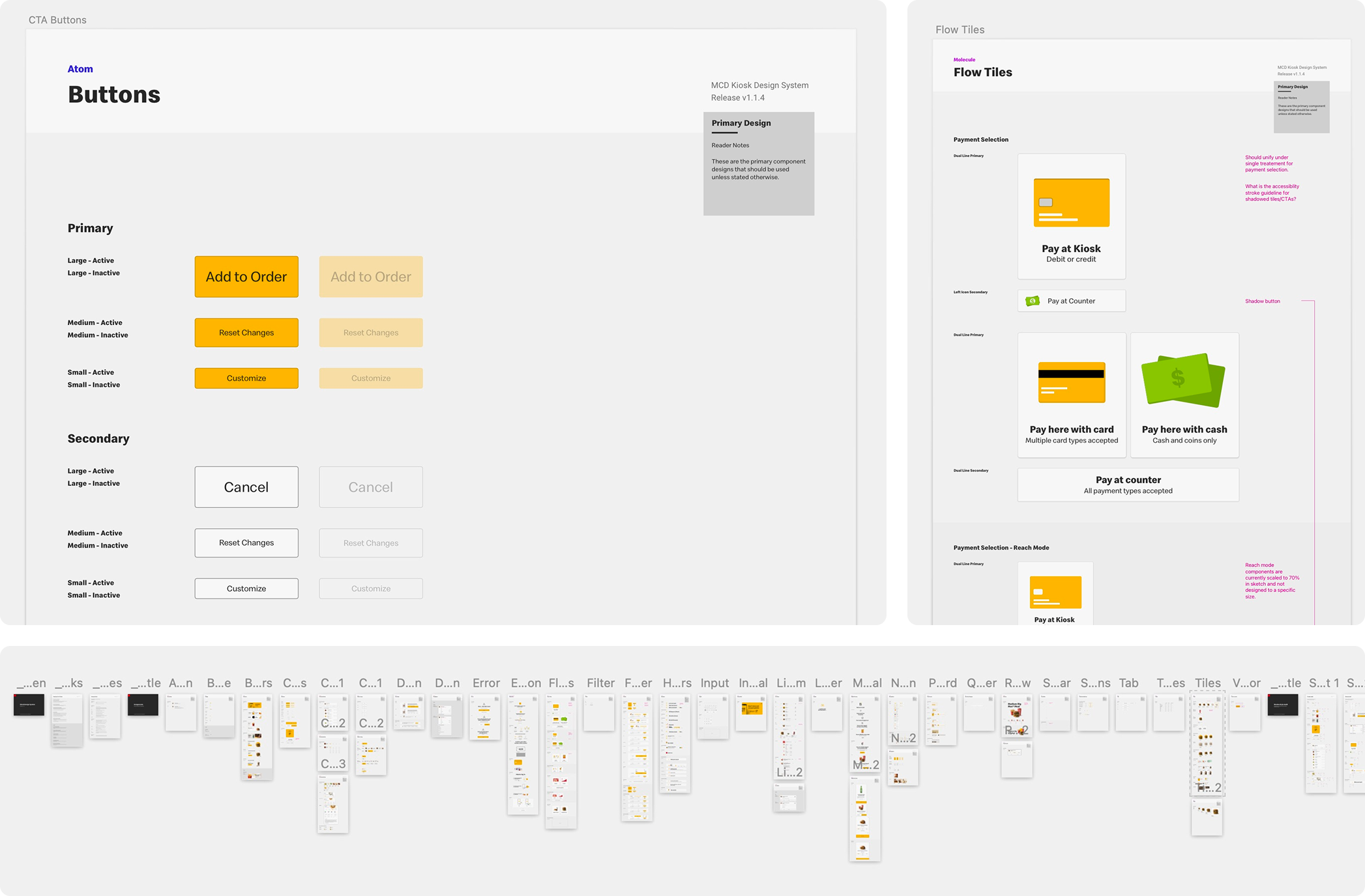
Rebuild & Document
With everything audited, documented, and our global styles were set, we needed to rebuild everything to meet new specs we created for all channels.
As components were finished, they went through exhaustive development reviews where we could present differences and changes to the component structures.
Additionally, we began our documentation process for every permutation of component we would be moving forward with.
Fun fact: Our company decided to switch from Sketch to Figma about 90% of the way through this process. At the time, the two didn’t play so nice. So I built everything, twice.

This process also let me look at areas where team members could be more efficient. Time and again, we were building repetitive flows of screens that needed to exist but wouldn’t be touched. So we created template component files as well, allowing entire instances of screens to be added into files rapidly.
Kiosk files benefited from this greatly, as often we’d have to generate both standard flows, as well as accessibility-mode flows for Reach mode.
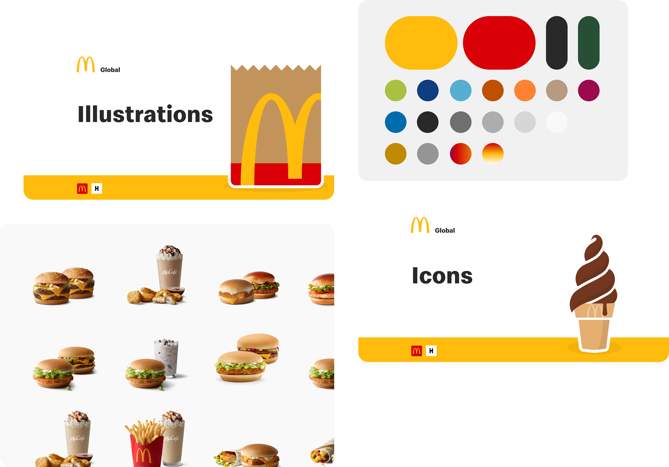
Feel-Good-Moments
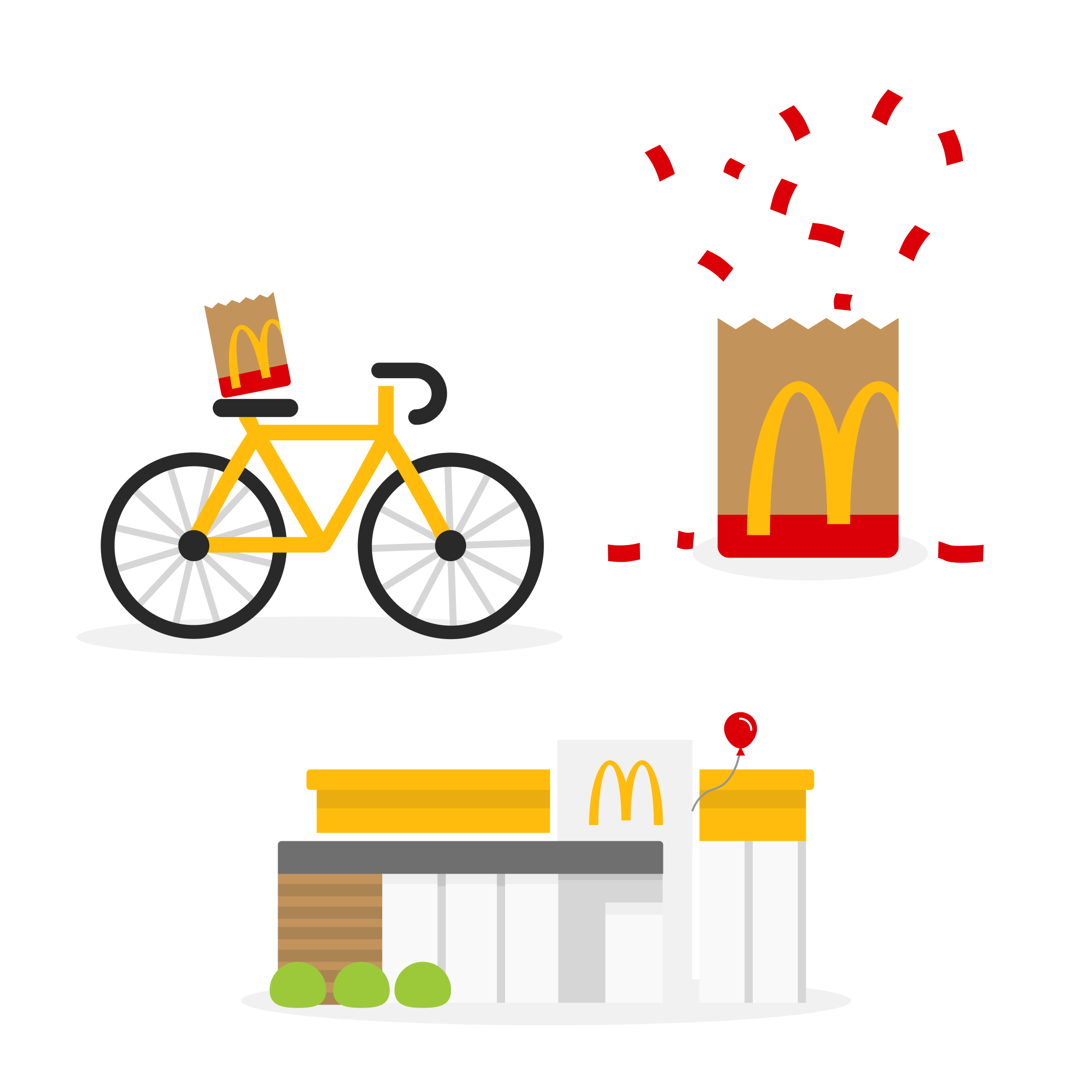
While the design system needed to be functional, it still needed to be distinctly McDonald’s. The illustrations and stylistic choices we made kept the brand alive in the components and templates.

Even the smallest details were considered in this process, including the icons. Each was designed with a signature ‘Fry-Tip’ giving McDonald’s a distinctly personalized set of icons to work with. Additionally, in this process we updated all of the product illustrations, creating a component system that allowed team members to swap illustrations freely when designing.
Going to Market
We repurposed an existing site that would allow us present documented components and guidelines for markets in one central location, eventually serving as a development hub with code snippets for every core component and template.
I helped write and manage all documentation across all three global product components, templates, and assets.
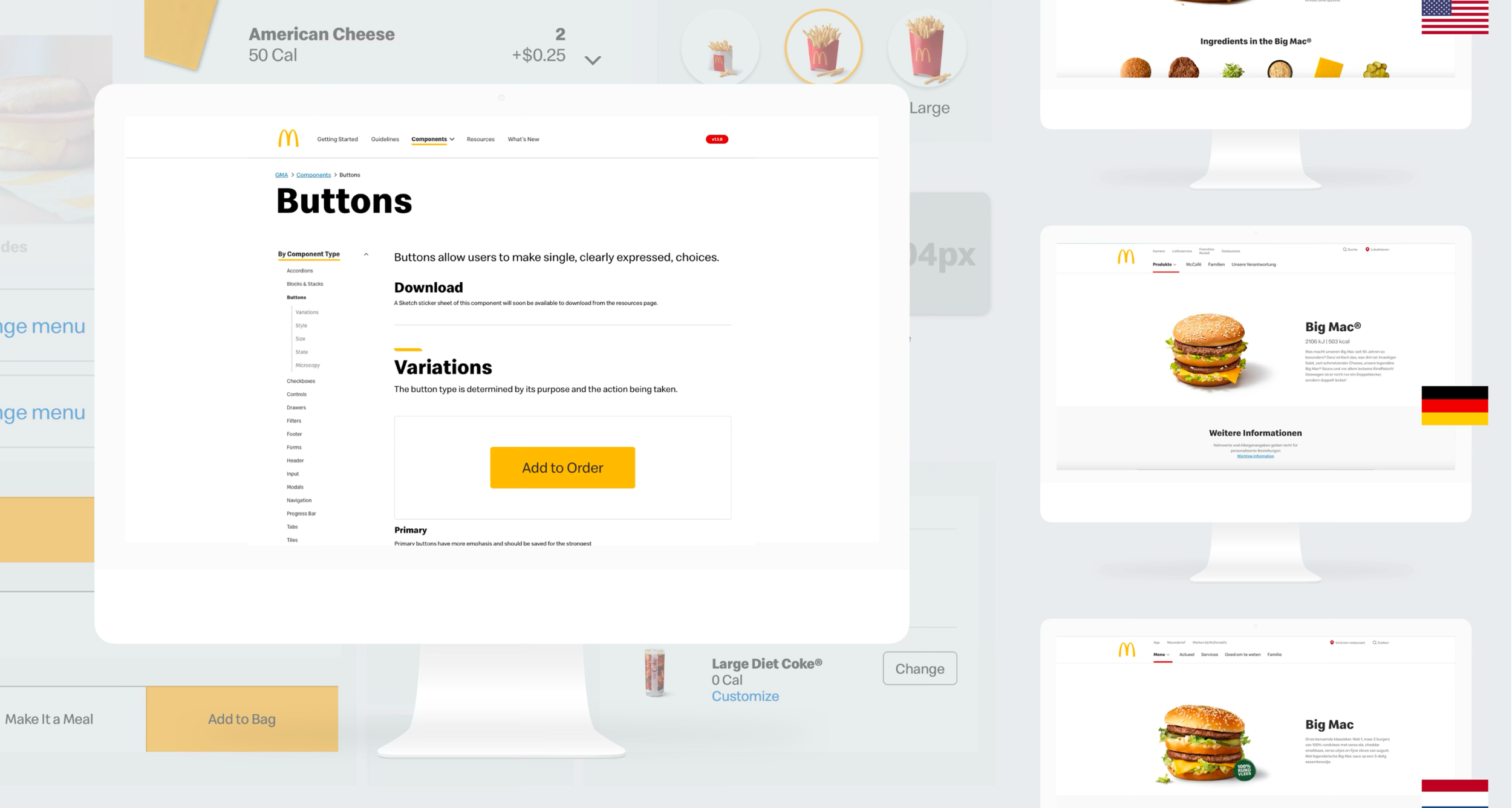
The site provided markets for the first time a single source of truth for all variations and assets, providing insight into what was available to be adapted by the market teams.
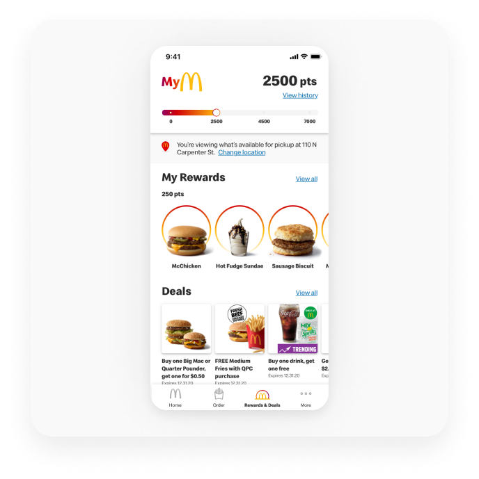
Built for mobile iOS & Android platforms, McDonald’s custom UI and accessibility patterns for a branded experience.
85 unique components
16 unique templates
GMA System
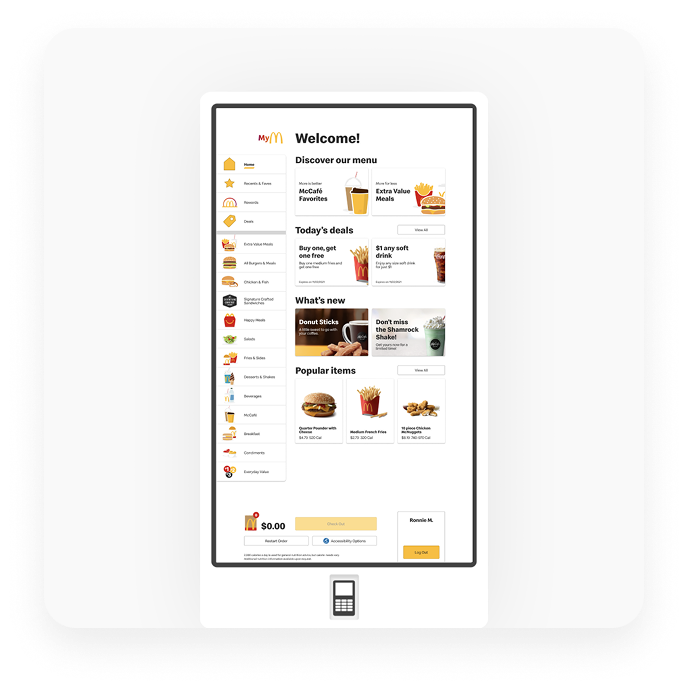
Built for in-restaurant ordering and fulfillment through touch interaction, custom orders and accessibility patterns.
135 unique components
23 unique templates
Kiosk System

A collection of colors that work with McDonald’s brand in a digital space.
28 unique styles
Brand & Color Library

Using Speedee typeface, each channel requires multiple type systems for inclusive design patterns.
32 unique styles
Type Library

McDonald’s icons are inspired by global iconography standards across all platforms to add clarity and guide users.
80+ unique icons
5 size variances
Filled & outlined versions
Icon Library

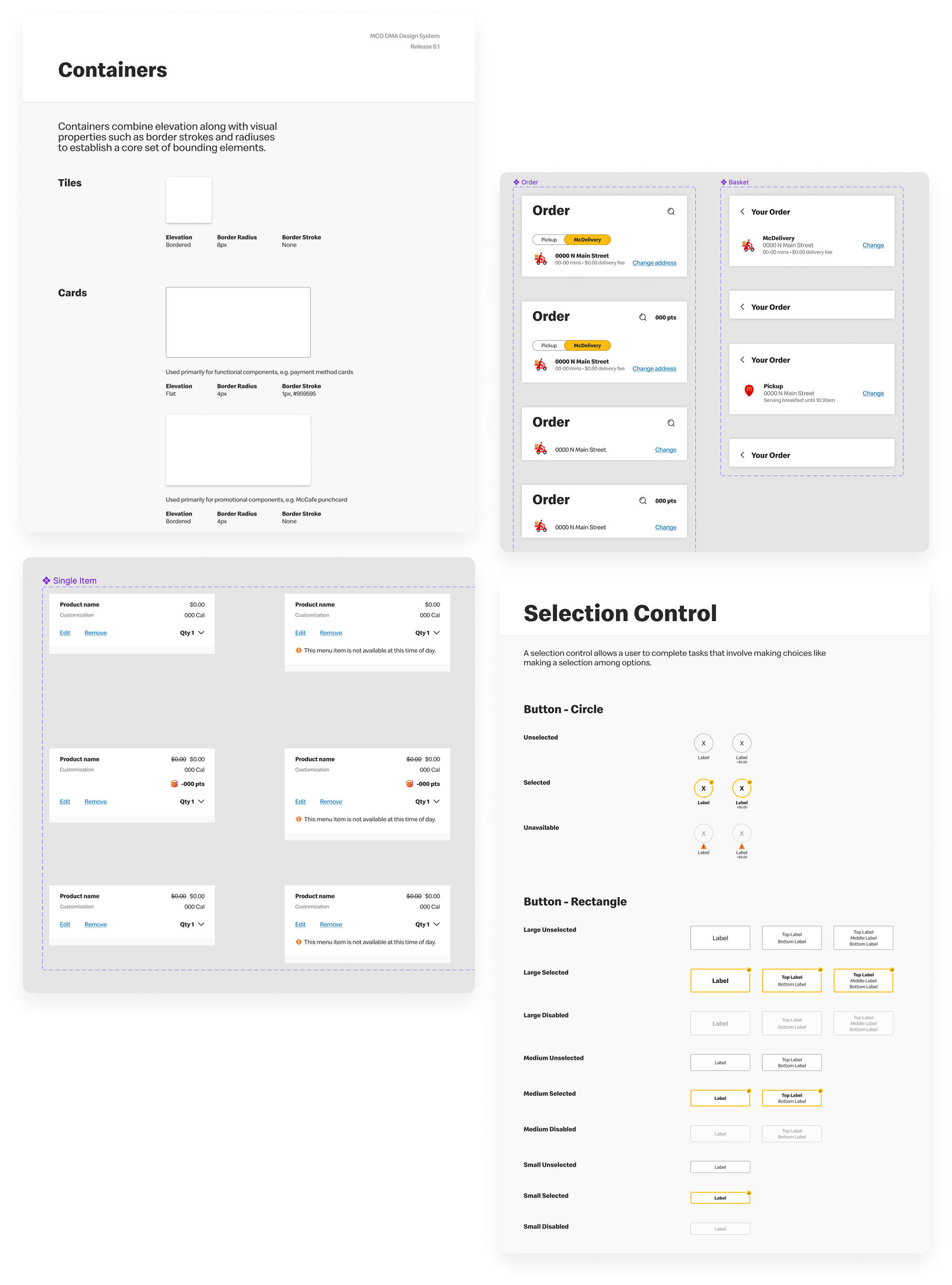
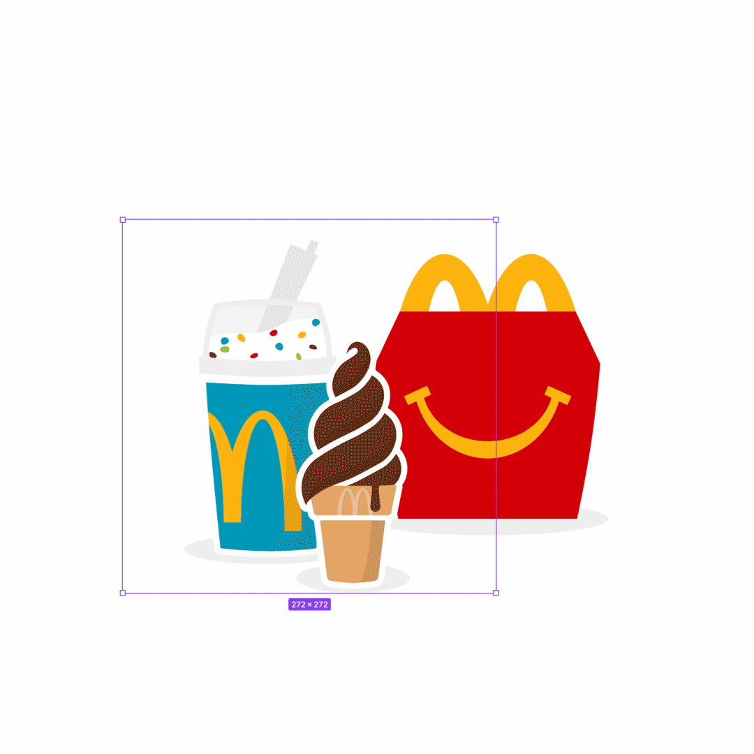
Product illustrations are used to communicate product simplicity while adding playfulness and personality.
13 unique components
Illustration Library

Feel-good moments are brought to life through a growing library of McDonald’s products.
210+ unique images
Product Photography

Not many people can say their Design System components got to be used in a Happy Meal toy!
Outcomes & Takeaways
Foundational Truth
We created the base for all others to work across three distinct products. A new source of truth for all work going forward.
Simplify Everywhere
The impact of this work was in how simple the systems were. We had fewer components than I think most folks expected because we were able to build things efficiently.
Smarter Not Harder
There was a 78% increase in productivity across UX teams following this work in terms of file management, creation, and eventual delivery.