Bespoke Physical Therapy
Building a client/physician app to support a quickly growing workflow
I designed the companion app and tablet experience for both the member and provider experiences for Bespoke, a physical therapy practice out of New York. Providers can build, assign, and track program statuses across all their members, while members can track and record progress of their recovery and fitness journey.
My Role
I led all upfront product definition work, writing user stories and product definition guides, as well as UX, UI, brand design, and development oversight.
The entirety of this project, from early UX process and all design iterations until the final product is available to review and walk through via virtual meeting. Please reach out!

Bespoke was leveraging countless digital and traditional tools for managing both their internal team as well as their clients. From hand-written notes to spreadsheets, texting their clients or Facetiming, it was clear they needed a singular source of truth. For providers, they needed a client management tool that could house all everything for their practice in a centralized location. On the member side, a companion app for members was needed to stay accountable during their recovery by completing programs, tracking progress, and contacting their provider.
An Aimless Beginning
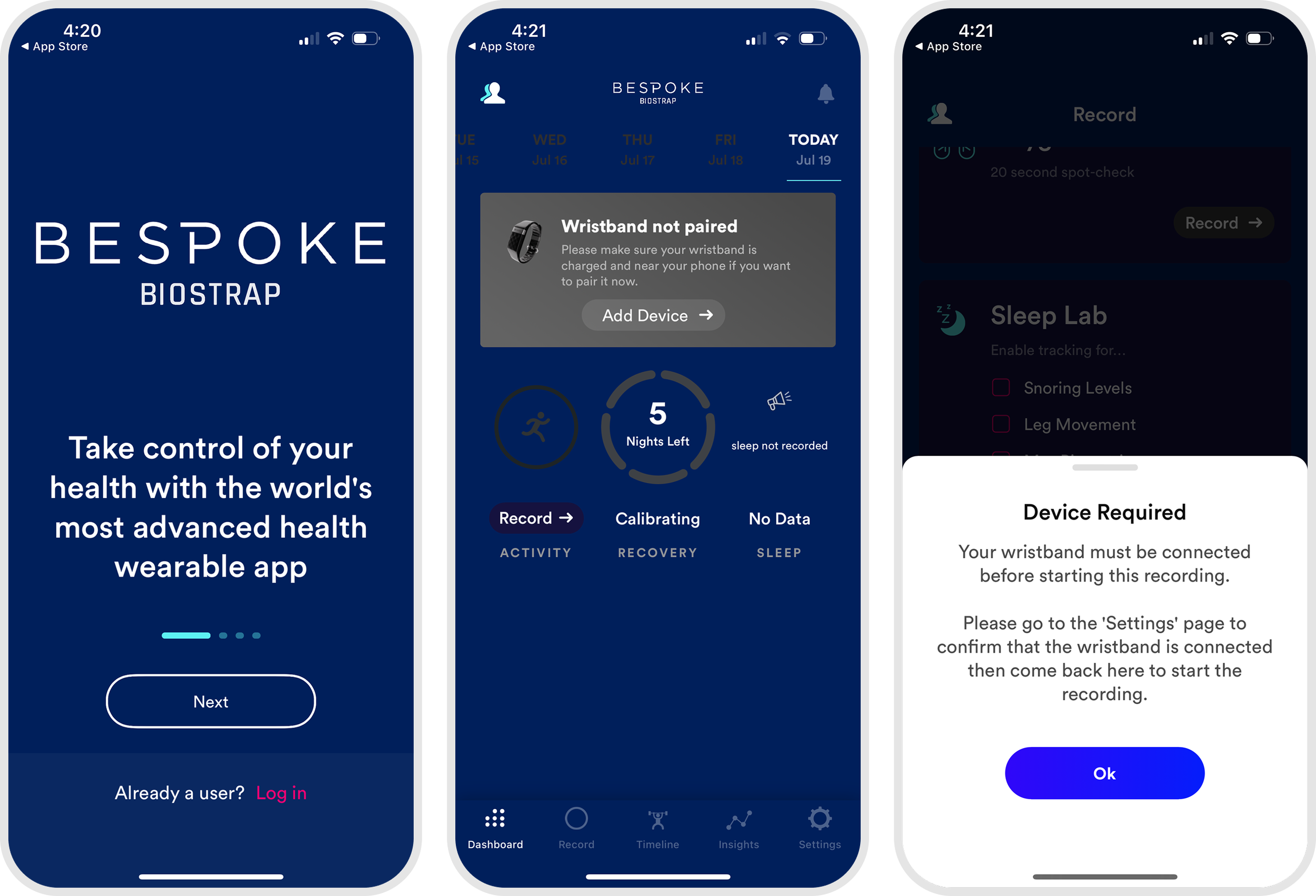
Prior to my team’s involvement, Bespoke was leveraging an out-the-box, re-skinned Biostrap app to offer a truncated experience for their current members.
To make matters worse, without a Biostrap product, none of the functionality within the app was supported.
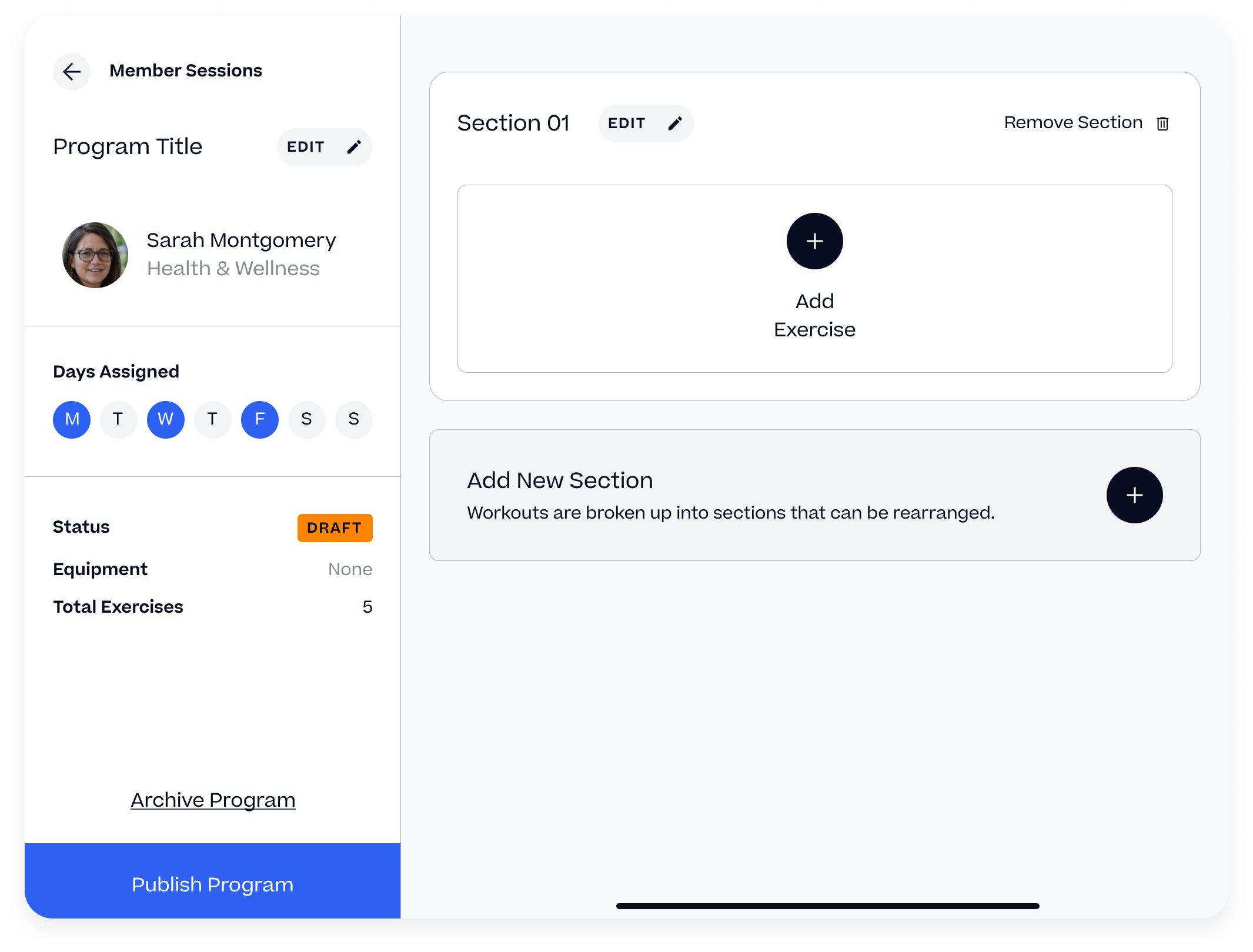
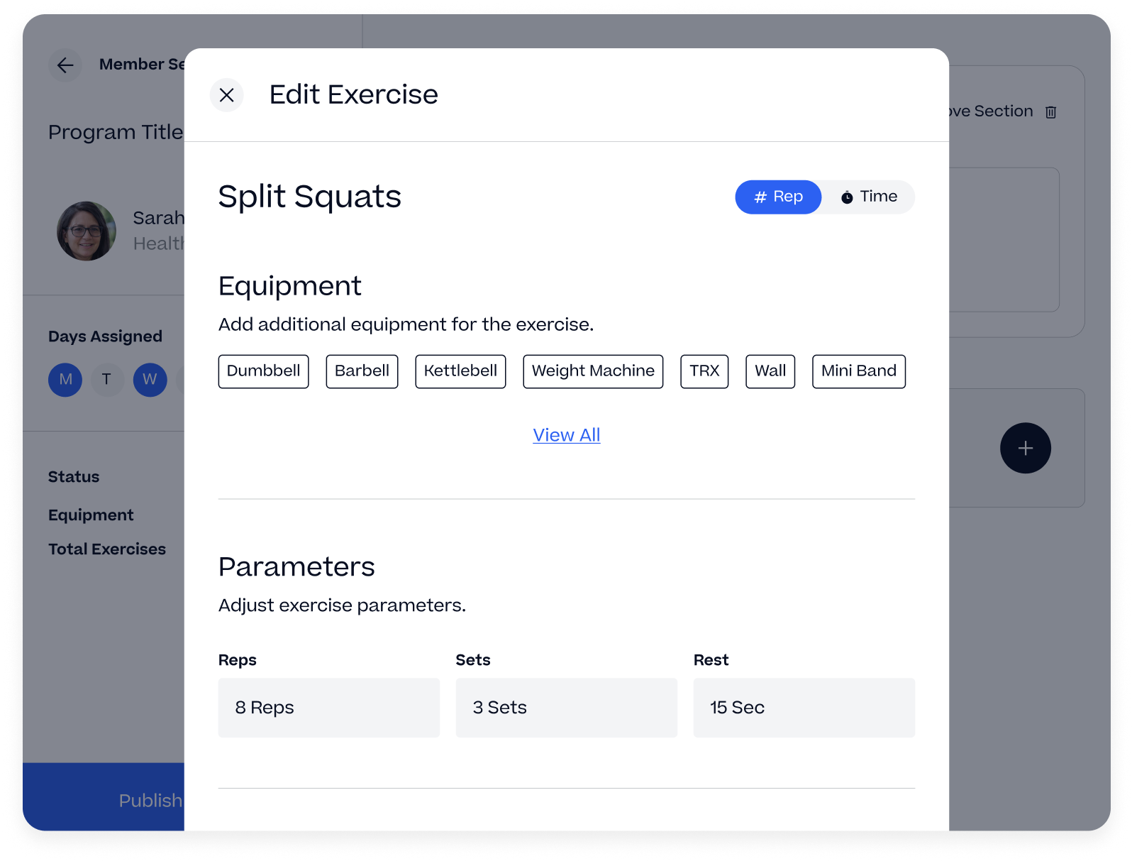
The Program Builder
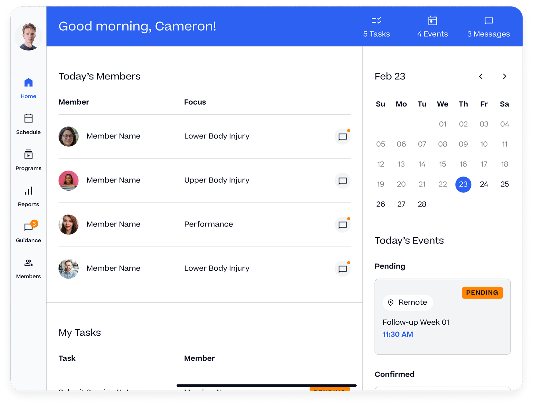
Our first focus was to unify the devices and the products providers would use. We recommended a unified, tablet experience each provider would use in their practice where we could offer a consistent product experience that would house all their feature needs.
The program builder was a complex tool that allowed providers to build unique programs based on their member’s needs. They could assign days, attach notes, and set all the exercise parameters as part of this build.
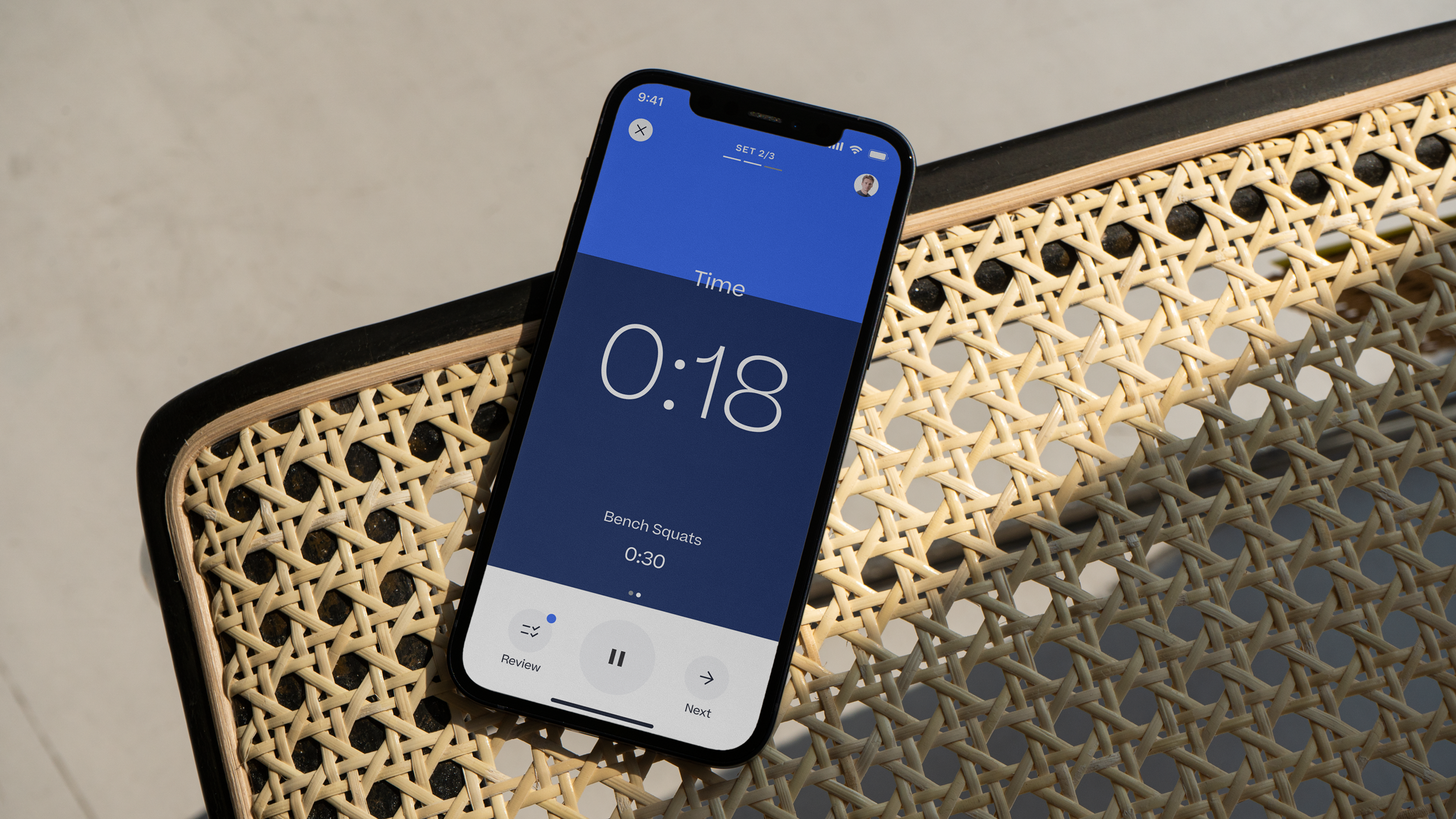
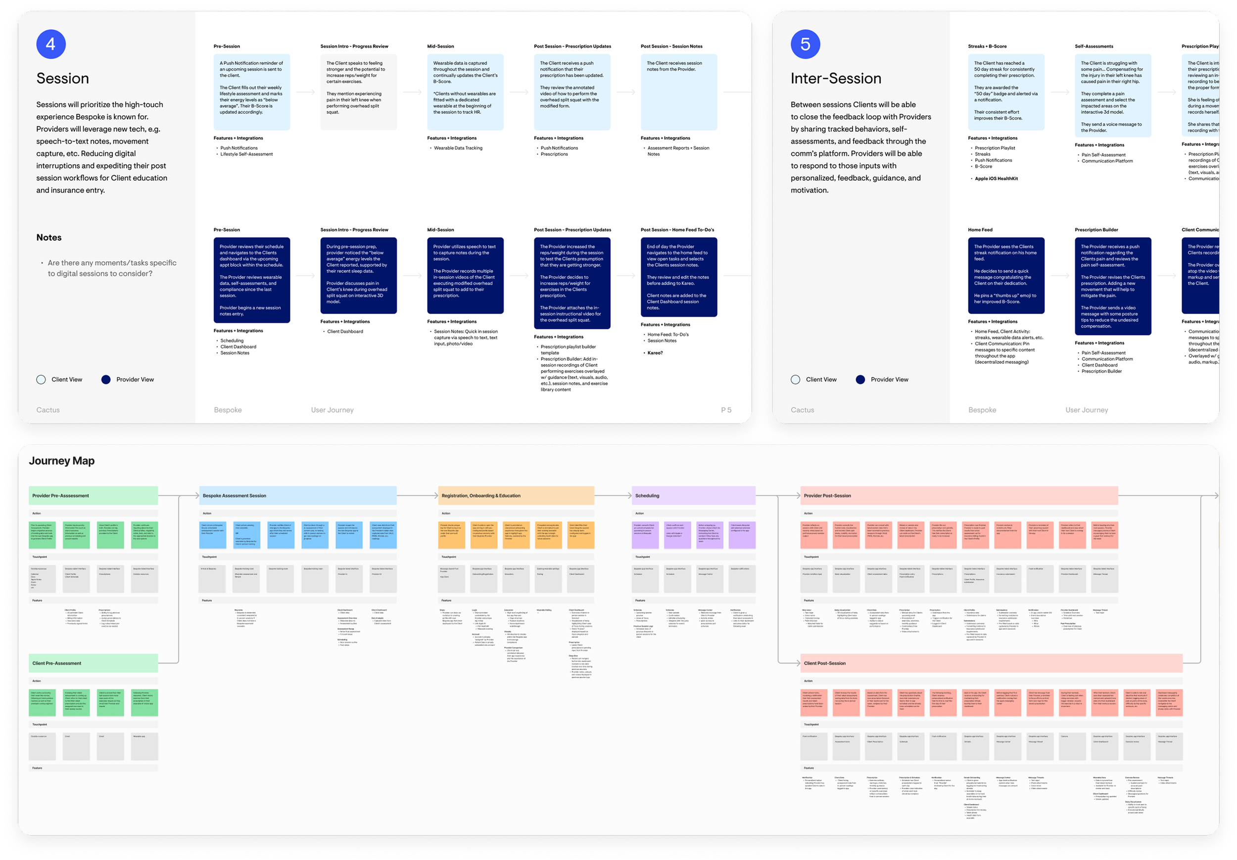
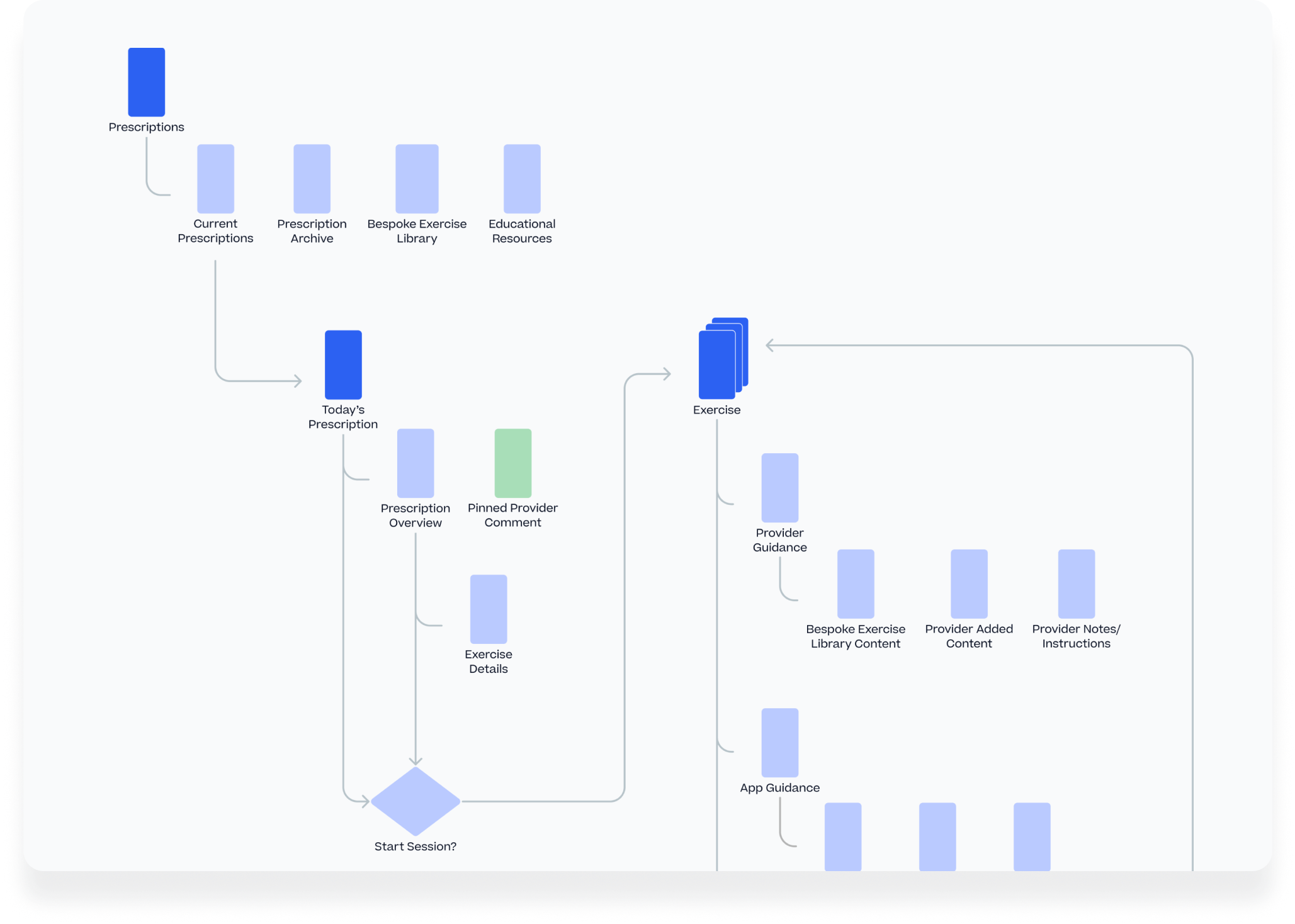
Program Sessions
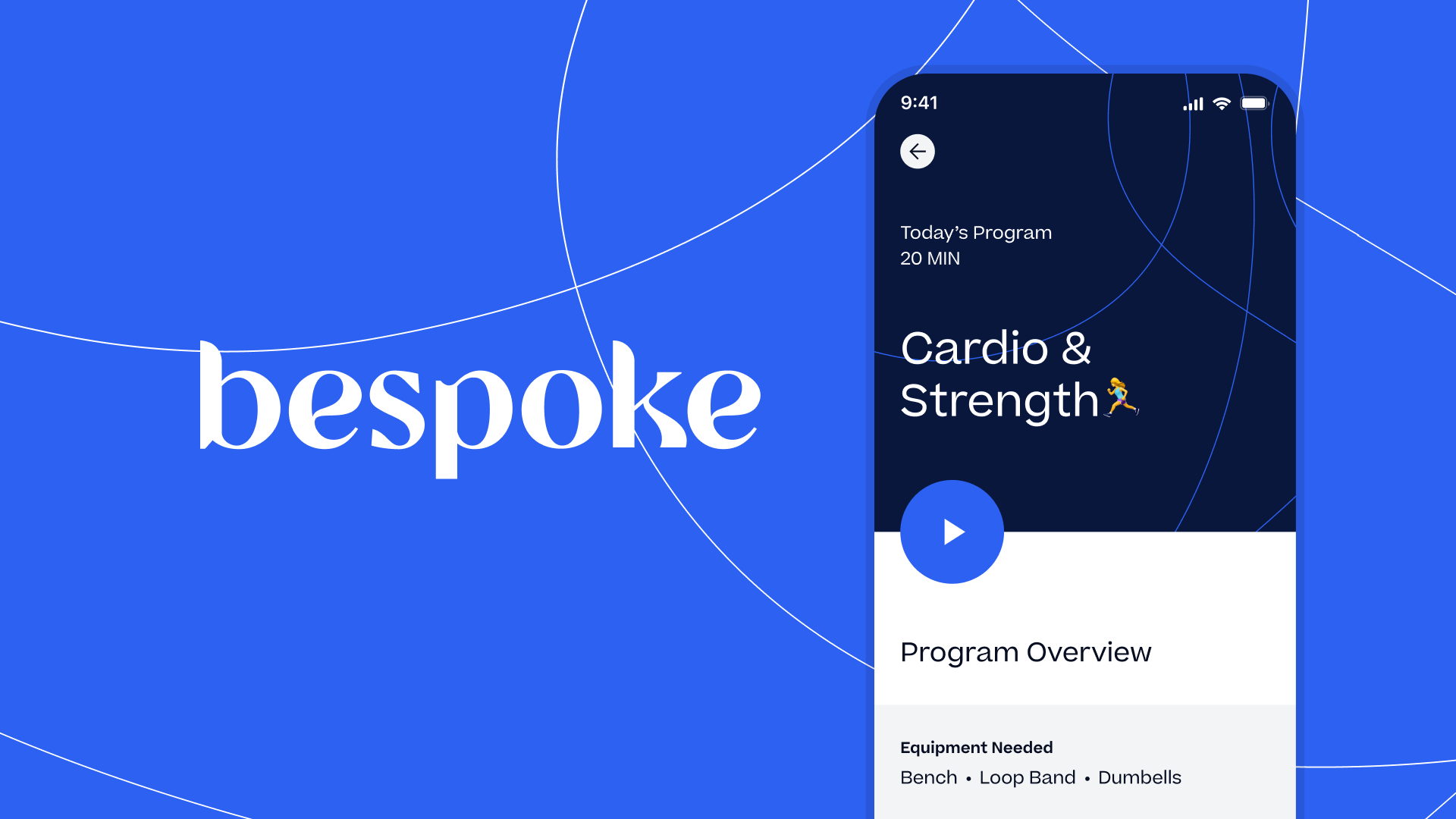
For the member, rather than a disparate series of hand-outs, spreadsheets, or notes from their provider, we built interactive, follow-along program sessions that could be tracked to see day-over-day progress.
This process included overseeing the production of video assets by the Bespoke team, as well as animating and developing the timing for both rep and time-based exercises.
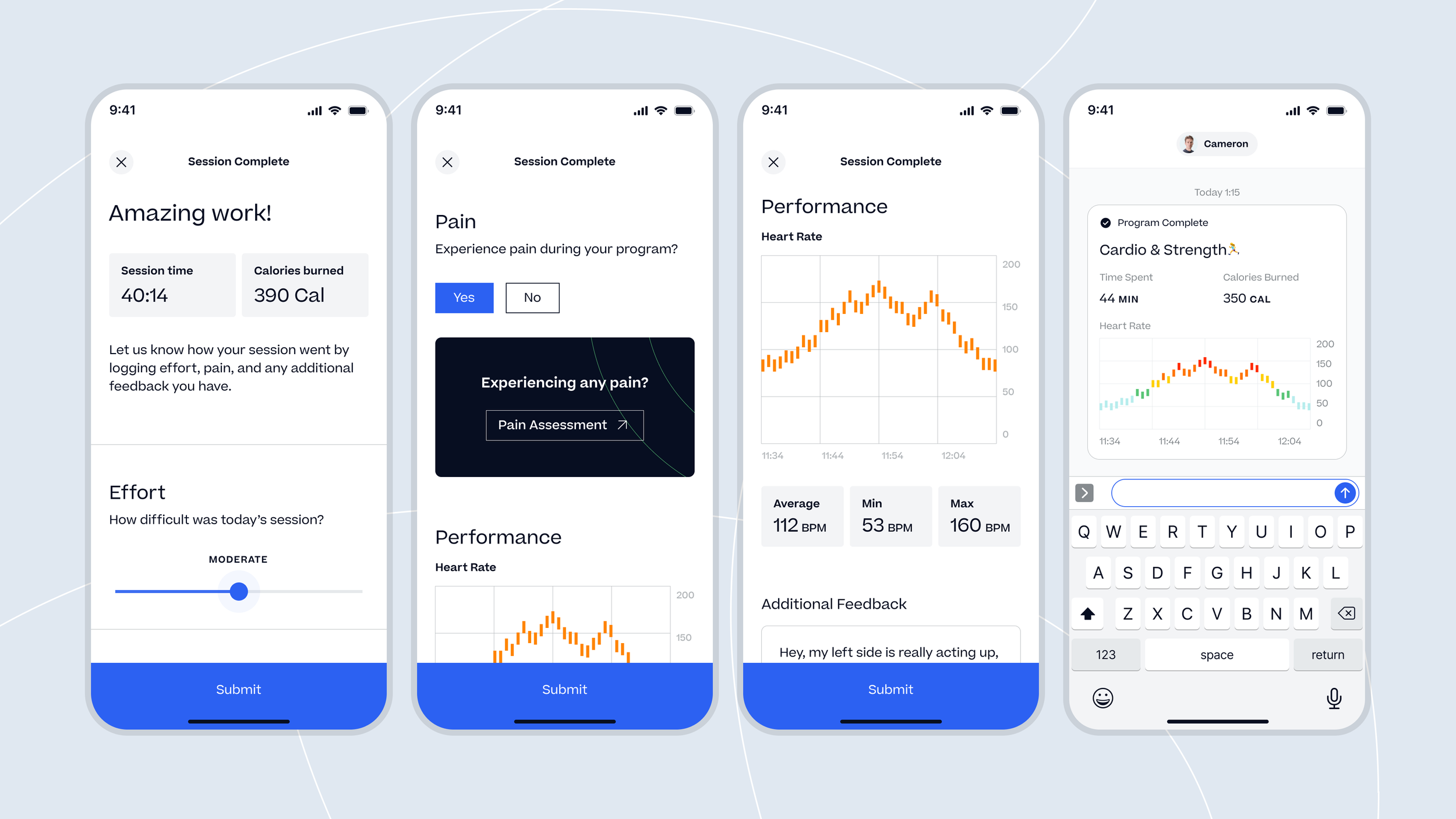
At the end of each program, published results are reviewable and sent as a message recap, with the ability to send feedback on difficulty as well as log any pain the member might be experiencing.

Pain Tracking
Accessible from the homepage or post-program session, I wanted to provide members a way they could consistently log pain they might be feeling as it relates to the assigned exercises or in daily life. This tool would give providers a way to easily view the logs, while members were given structure to better inform their providers of what might be bothering them.
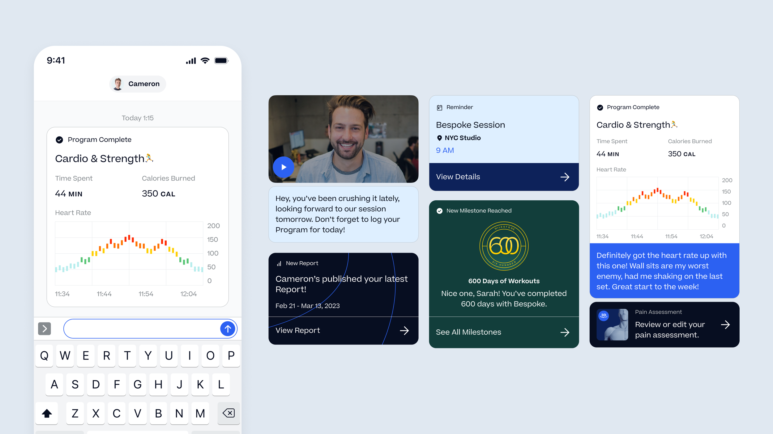
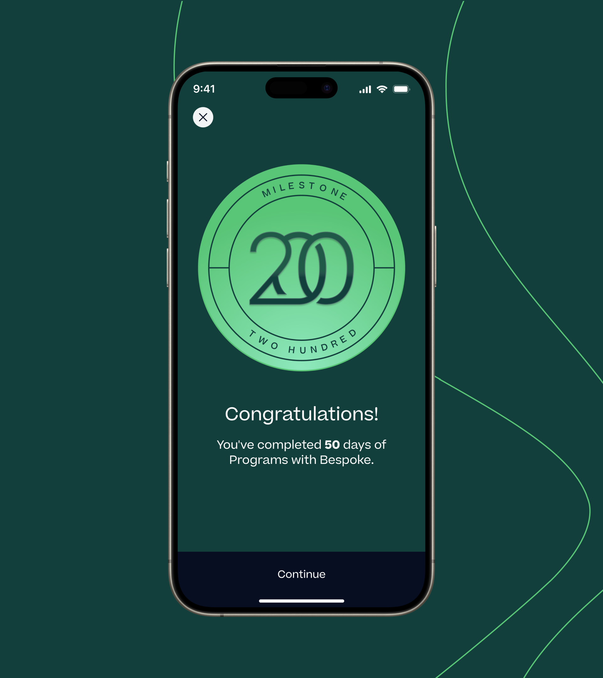
The Guidance tab is where all messaging with the member was done, from direct messages with their provider, to updates on their sessions, published reports, and celebration of milestones.

Reports
Every few months, providers would generate data reports of member progress. This would originally only include testing done in-person, as that was all that could be tracked manually. Now, providers would have a dashboard of all data we could collect during the reporting period and publish a thorough look back at everything the member had accomplished.
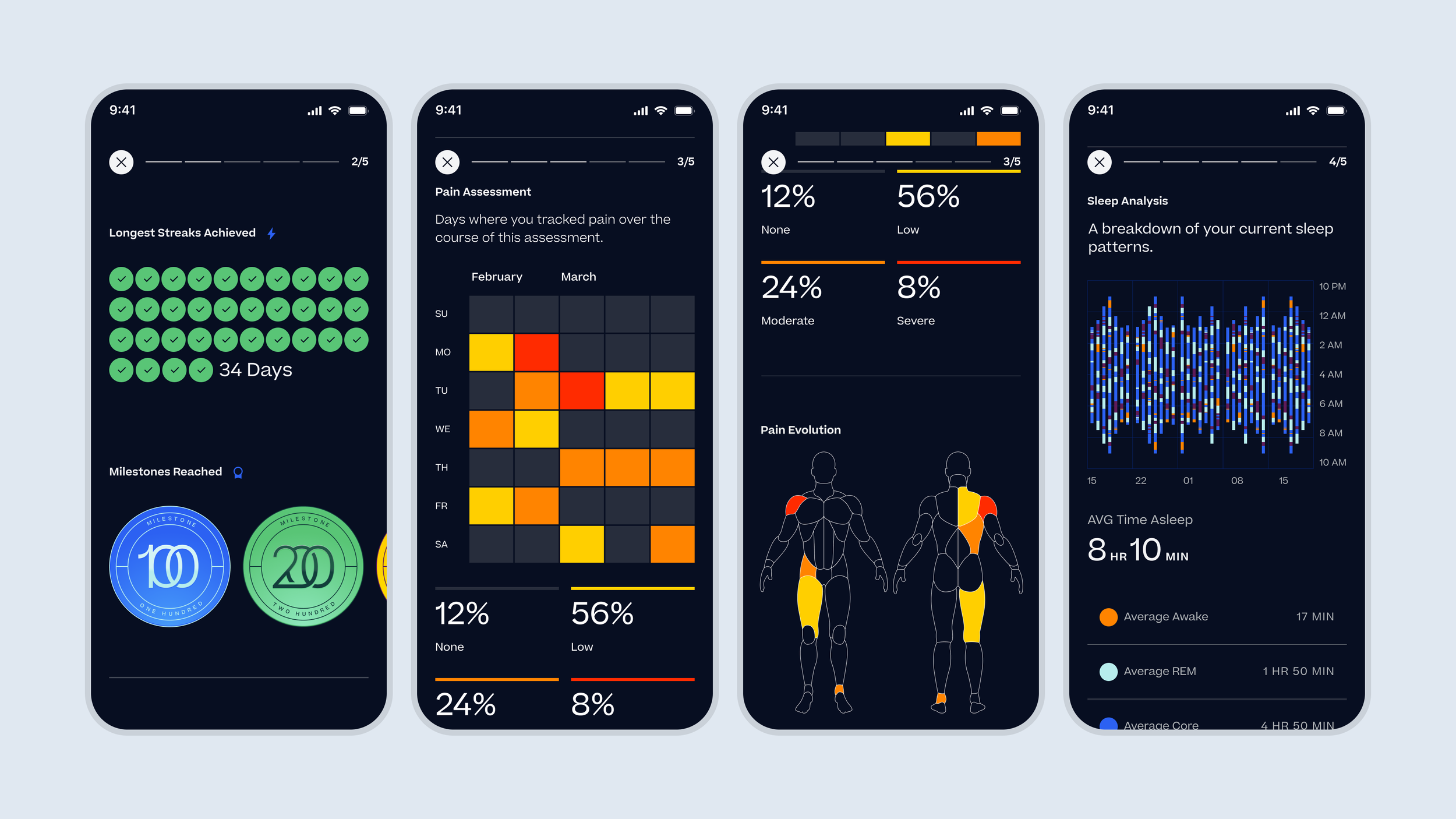
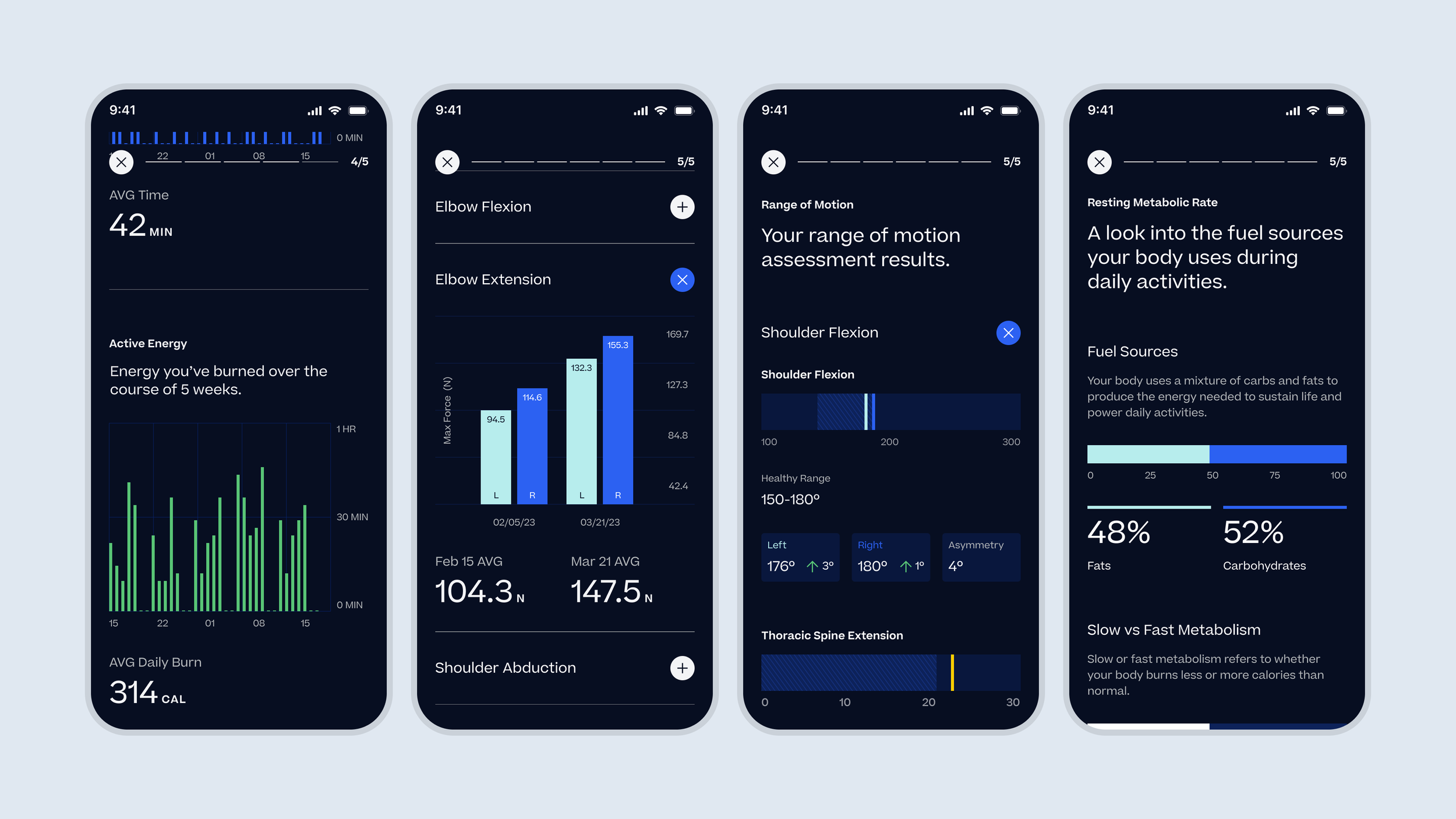
For members, reports were broken down into chapters and would be published to their app by the provider.

Bespoke Brand
Parallel to the product work, I collaborated with our stakeholders at Bespoke to build a better brand system that we could use in the digital products. Excluding their logo which we agreed not to touch, I updated their brand colors, typography, and usage guidelines to work not just for their marketing materials but to be used in the products themselves, giving us a solid foundation to design with.


Journey Phases
Before any of the actual product design work can begin, I need to understand the needs and asks of the client. To do that, I needed to get familiar with their existing workflows. This is an example of an early, ultra-simple user journey phase breakdown we used to get alignment.
I love creating this kind of deliverable before getting into the weedy details. It aligns the team, the clients, and gives us a north star to return back to throughout the project.
From there, I could get into the details and better outline key user actions, touch points, and potential features at every phase we were considering.
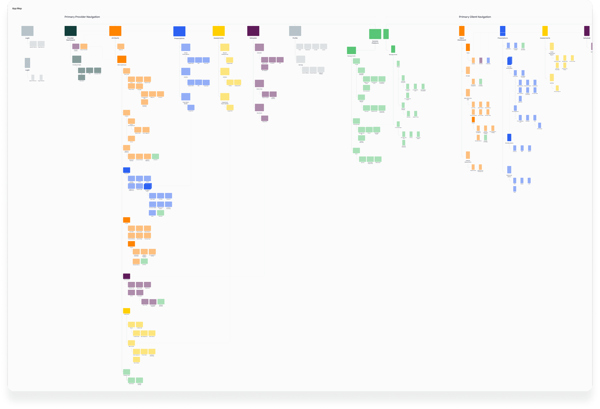
Product Architecture
With features aligned, I could detail out the skeleton of the product offering and see how everything connects from a birds eye view.
Where needed, I built out more direct user flows to help understand the more complex needs of the features.
Outcomes & Takeaways
User A, User B
Every decision made on one product impacted the other, every time. It was crucial to understand the feature set to avoid missteps in the process.
Speed ≠ Success (usually)
We designed this brand and experience in just under 3 months. And while proud of that, work like this takes time to get right, and I wish we would have had more of it.